If you notice any inconsistencies between this Grid Layout Module and the Flexible Box Layout Module, please report them to the CSSWG, as this is likely an error.
1. Introduction
This section is not normative.
Grid Layout is a layout model for CSS that has powerful abilities to control the sizing and positioning of boxes and their contents. Unlike Flexible Box Layout, which is single-axis–oriented, Grid Layout is optimized for 2-dimensional layouts: those in which alignment of content is desired in both dimensions.


In addition, due to its ability to explicitly position items in the grid, Grid Layout allows dramatic transformations in visual layout structure without requiring corresponding markup changes. By combining media queries with the CSS properties that control layout of the grid container and its children, authors can adapt their layout to changes in device form factors, orientation, and available space, while preserving a more ideal semantic structuring of their content across presentations.
Although many layouts can be expressed with either Grid or Flexbox, they each have their specialties. Grid enforces 2-dimensional alignment, uses a top-down approach to layout, allows explicit overlapping of items, and has more powerful spanning capabilities. Flexbox focuses on space distribution within an axis, uses a simpler bottom-up approach to layout, can use a content-size–based line-wrapping system to control its secondary axis, and relies on the underlying markup hierarchy to build more complex layouts. It is expected that both will be valuable and complementary tools for CSS authors.
Grid Level 2 adds the subgrid feature: a subgridded axis is one which matches up its grid lines to lines in the element’s parent’s grid, and which derives the sizes of its tracks through this integration with the parent grid.
1.1. Background and Motivation
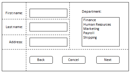
As websites evolved from simple documents into complex, interactive applications, techniques for document layout, e.g. floats, were not necessarily well suited for application layout. By using a combination of tables, JavaScript, or careful measurements on floated elements, authors discovered workarounds to achieve desired layouts. Layouts that adapted to the available space were often brittle and resulted in counter-intuitive behavior as space became constrained. As an alternative, authors of many web applications opted for a fixed layout that cannot take advantage of changes in the available rendering space on a screen.
The capabilities of grid layout address these problems. It provides a mechanism for authors to divide available space for layout into columns and rows using a set of predictable sizing behaviors. Authors can then precisely position and size the building block elements of their application into the grid areas defined by the intersections of these columns and rows. The following examples illustrate the adaptive capabilities of grid layout, and how it allows a cleaner separation of content and style.
1.1.1. Adapting Layouts to Available Space
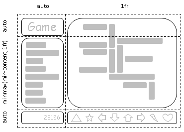

Grid layout can be used to intelligently resize elements within a webpage. The adjacent figures represent a game with five major components in the layout: the game title, stats area, game board, score area, and control area. The author’s intent is to divide the space for the game such that:
- The stats area always appears immediately under the game title.
- The game board appears to the right of the stats and title.
- The top of the game title and the game board should always align.
- The bottom of the game board and bottom of the stats area align when the game has reached its minimum height. In all other cases the game board will stretch to take advantage of all the space available to it.
- The controls are centered under the game board.
- The top of the score area is aligned to the top of the controls area.
- The score area is beneath the stats area.
- The score area is aligned to the controls beneath the game board.
The following grid layout example shows how an author might achieve all the sizing, placement, and alignment rules declaratively.
/** * Define the space for each grid item by declaring the grid * on the grid container . */ #grid{ /** * Two columns: * 1. the first sized to content, * 2. the second receives the remaining space * (but is never smaller than the minimum size of the board * or the game controls, which occupy this column [Figure 4]) * * Three rows: * 3. the first sized to content, * 4. the middle row receives the remaining space * (but is never smaller than the minimum height * of the board or stats areas) * 5. the last sized to content. */ display: grid; grid-template-columns : /* 1 */ auto/* 2 */ 1 fr ; grid-template-rows : /* 3 */ auto/* 4 */ 1 fr /* 5 */ auto; } /* Specify the position of each grid item using coordinates on * the 'grid-row' and 'grid-column' properties of each grid item . */ #title{ grid-column : 1 ; grid-row : 1 ; } #score{ grid-column : 1 ; grid-row : 3 ; } #stats{ grid-column : 1 ; grid-row : 2 ; align-self : start; } #board{ grid-column : 2 ; grid-row : 1 / span2 ; } #controls{ grid-column : 2 ; grid-row : 3 ; justify-self : center; }
< div id = "grid" > < div id = "title" > Game Title</ div > < div id = "score" > Score</ div > < div id = "stats" > Stats</ div > < div id = "board" > Board</ div > < div id = "controls" > Controls</ div > </ div >
Note: There are multiple ways to specify the structure of the grid and to position and size grid items, each optimized for different scenarios.
1.1.2. Source-Order Independence


Continuing the prior example, the author also wants the game to adapt to different devices. Also, the game should optimize the placement of the components when viewed either in portrait or landscape orientation (Figures 6 and 7). By combining grid layout with media queries, the author is able to use the same semantic markup, but rearrange the layout of elements independent of their source order, to achieve the desired layout in both orientations.
The following example uses grid layout’s ability to name the space which will be occupied by a grid item. This allows the author to avoid rewriting rules for grid items as the grid’s definition changes.
@media ( orientation: portrait) { #grid{ display : grid; /* The rows, columns and areas of the grid are defined visually * using the grid-template-areas property. Each string is a row, * and each word an area. The number of words in a string * determines the number of columns. Note the number of words * in each string must be identical. */ grid-template-areas:"title stats" "score stats" "board board" "ctrls ctrls" ; /* The way to size columns and rows can be assigned with the * grid-template-columns and grid-template-rows properties. */ grid-template-columns: auto1 fr ; grid-template-rows : auto auto1 fr auto; } } @media ( orientation: landscape) { #grid{ display : grid; /* Again the template property defines areas of the same name, * but this time positioned differently to better suit a * landscape orientation. */ grid-template-areas:"title board" "stats board" "score ctrls" ; grid-template-columns : auto1 fr ; grid-template-rows : auto1 fr auto; } } /* The grid-area property places a grid item into a named * area of the grid. */ #title{ grid-area : title} #score{ grid-area : score} #stats{ grid-area : stats} #board{ grid-area : board} #controls{ grid-area : ctrls}
< div id = "grid" > < div id = "title" > Game Title</ div > < div id = "score" > Score</ div > < div id = "stats" > Stats</ div > < div id = "board" > Board</ div > < div id = "controls" > Controls</ div > </ div >
Note: The reordering capabilities of grid layout intentionally affect only the visual rendering, leaving speech order and navigation based on the source order. This allows authors to manipulate the visual presentation while leaving the source order intact and optimized for non-CSS UAs and for linear models such as speech and sequential navigation.
Grid item placement and reordering must not be used as a substitute for correct source ordering, as that can ruin the accessibility of the document.
1.2. Value Definitions
This specification follows the CSS property definition conventions from [CSS2] using the value definition syntax from [CSS-VALUES-3]. Value types not defined in this specification are defined in CSS Values & Units [CSS-VALUES-3]. Combination with other CSS modules may expand the definitions of these value types.
In addition to the property-specific values listed in their definitions, all properties defined in this specification also accept the CSS-wide keywords as their property value. For readability they have not been repeated explicitly.
2. Overview
This section is not normative.
Grid Layout controls the layout of its content through the use of a grid: an intersecting set of horizontal and vertical lines which create a sizing and positioning coordinate system for the grid container’s contents. Grid Layout features
- fixed, flexible, and content-based track sizing functions
- explicit item placement via forwards (positive) and backwards (negative) numerical grid coordinates, named grid lines, and named grid areas; automatic item placement into empty areas, including reordering with order
- space-sensitive track repetition and automatic addition of rows or columns to accommodate additional content
- control over alignment and spacing with margins, gutters, and the alignment properties
- the ability to overlap content and control layering with z-index
Grid containers can be nested or mixed with flex containers as necessary to create more complex layouts.
2.1. Declaring the Grid
The tracks (rows and columns) of the grid are declared and sized either explicitly through the explicit grid properties or are implicitly created when items are placed outside the explicit grid. The grid shorthand and its sub-properties define the parameters of the grid. § 7 Defining the Grid
-
The following declares a grid with four named areas:
H,A,B, andF. The first column is sized to fit its contents (auto), and the second column takes up the remaining space (1fr). Rows default to auto (content-based) sizing; the last row is given a fixed size of 30px.main { display: grid; grid: "H H " "A B " "F F " 30px / auto 1fr; } -
The following declares a grid with as many rows of at least 5em
as will fit in the height of the grid container (100vh).
The grid has no explicit columns;
instead columns are added as content is added,
the resulting column widths are equalized (1fr).
Since content overflowing to the right won’t print,
an alternate layout for printing adds rows instead.
main { display: grid; grid: repeat(auto-fill, 5em) / auto-flow 1fr; height: 100vh; } @media print { main { grid: auto-flow 1fr / repeat(auto-fill, 5em); } } -
The following declares a grid with 5 evenly-sized columns
and three rows,
with the middle row taking up all remaining space
(and at least enough to fit its contents).
main {
  display: grid;
  grid: auto 1fr auto / repeat(5, 1fr);
  min-height: 100vh;
}
2.2. Placing Items
The contents of the grid container are organized into individual grid items (analogous to flex items), which are then assigned to predefined areas in the grid. They can be explicitly placed using coordinates through the grid-placement properties or implicitly placed into empty areas using auto-placement. § 8 Placing Grid Items
grid-area: a;          /* Place into named grid area “a”     */
grid-area: auto;       /* Auto-place into next empty area    */
grid-area: 2 / 4;      /* Place into row 2, column 4         */
grid-area: 1 / 3 / -1; /* Place into column 3, span all rows */
grid-area: header-start / sidebar-start / footer-end / sidebar-end;
                       /* Place using named lines            */
These are equivalent to the following grid-row + grid-column declarations:
grid-row: a;                         grid-column: a;
grid-row: auto;                      grid-column: auto;
grid-row: 2;                         grid-column: 4;
grid-row: 1 / -1;                    grid-column: 3;
grid-row: header-start / footer-end; grid-column: sidebar-start / sidebar-end;
They can further be decomposed into the grid-row-start/grid-row-end/grid-column-start/grid-column-end longhands, e.g.
grid-area: a;
/* Equivalent to grid-row-start: a; grid-column-start: a; grid-row-end: a; grid-column-end: a; */

grid-area: 1 / 3 / -1;
/* Equivalent to grid-row-start: 1; grid-column-start: 3; grid-row-end: -1; grid-column-end: auto; */
2.3. Sizing the Grid
Once the grid items have been placed, the sizes of the grid tracks (rows and columns) are calculated, accounting for the sizes of their contents and/or available space as specified in the grid definition.
The resulting sized grid is aligned within the grid container according to the grid container’s align-content and justify-content properties. § 11 Alignment and Spacing
main {
  display: grid;
  grid: auto-flow auto / repeat(auto-fill, 5em);
  min-height: 100vh;
  justify-content: space-between;
  align-content: safe center;
}
Finally each grid item is sized and aligned within its assigned grid area, as specified by its own sizing [CSS2] and alignment properties [CSS-ALIGN-3].
3. Grid Layout Concepts and Terminology
In grid layout, the content of a grid container is laid out by positioning and aligning it into a grid. The grid is an intersecting set of horizontal and vertical grid lines that divides the grid container’s space into grid areas, into which grid items (representing the grid container’s content) can be placed. There are two sets of grid lines: one set defining columns that run along the block axis, and an orthogonal set defining rows along the inline axis. [CSS3-WRITING-MODES]

3.1. Grid Lines
Grid lines are the horizontal and vertical dividing lines of the grid. A grid line exists on either side of a column or row. They can be referred to by numerical index, or by an author-specified name. A grid item references the grid lines to determine its position within the grid using the grid-placement properties.
This first example demonstrates how an author would position a grid item using grid line numbers:
#grid{ display : grid; grid-template-columns : 150 px 1 fr ; grid-template-rows : 50 px 1 fr 50 px ; } #item1{ grid-column : 2 ; grid-row-start : 1 ; grid-row-end : 4 ; }
This second example uses explicitly named grid lines:
/* equivalent layout to the prior example, but using named lines */ #grid{ display : grid; grid-template-columns : 150 px [ item1-start] 1 fr [ item1-end]; grid-template-rows : [ item1-start] 50 px 1 fr 50 px [ item1-end]; } #item1{ grid-column : item1-start / item1-end; grid-row : item1-start / item1-end; }
3.2. Grid Tracks and Cells
Grid track is a generic term for a grid column or grid row—in other words, it is the space between two adjacent grid lines. Each grid track is assigned a sizing function, which controls how wide or tall the column or row may grow, and thus how far apart its bounding grid lines are. Adjacent grid tracks can be separated by gutters but are otherwise packed tightly.
A grid cell is the intersection of a grid row and a grid column. It is the smallest unit of the grid that can be referenced when positioning grid items.
#grid {
  display: grid;
  grid-template-columns: 150px 1fr;  /* two columns */
  grid-template-rows: 50px 1fr 50px; /* three rows  */
}
3.3. Grid Areas
A grid area is the logical space used to lay out one or more grid items. A grid area consists of one or more adjacent grid cells. It is bound by four grid lines, one on each side of the grid area, and participates in the sizing of the grid tracks it intersects. A grid area can be named explicitly using the grid-template-areas property of the grid container, or referenced implicitly by its bounding grid lines. A grid item is assigned to a grid area using the grid-placement properties.
/* using the template syntax */
#grid  {
  display: grid;
  grid-template-areas: ". a"
                       "b a"
                       ". a";
  grid-template-columns: 150px 1fr;
  grid-template-rows: 50px 1fr 50px;
  height: 100vh;
}

#item1 { grid-area: a }
#item2 { grid-area: b }
#item3 { grid-area: b }

/* Align items 2 and 3 at different points in the grid area "b".  */
/* By default, grid items are stretched to fit their grid area    */
/* and these items would layer one over the other. */
#item2 { align-self: start; }
#item3 { justify-self: end; align-self: end; }
A grid item’s grid area forms the containing block into which it is laid out. Grid items placed into the same grid area do not directly affect each other’s layout. Indirectly, however, a grid item occupying a grid track with an intrinsic sizing function can affect the size of that track (and thus the positions of its bounding grid lines), which in turn can affect the position or size of another grid item.
3.4. Nested vs. Subgridded Items
A grid item can itself be a grid container by giving it display: grid. In the general case the layout of this nested grid’s contents will be independent of the layout of the parent grid it participates in.
However, in some cases it might be necessary for the contents of multiple grid items to align to each other. A nested grid can defer the definition of its rows and/or columns to its parent grid container, making it a subgrid. In this case, the grid items of the subgrid participate in sizing the parent grid, allowing the contents of both grids to align. See § 9 Subgrids.
A subgrid is established by the subgrid keyword of grid-template-rows or grid-template-columns, and can be subgridded in either axis or in both. A grid that has no subgridded axis is a standalone grid.
< ul > < li >< label > Name:</ label > < input name = fn > < li >< label > Address:</ label > < input name = address > < li >< label > Phone:</ label > < input name = phone > </ ul >
We want the labels and inputs to align, and we want to style each list item with a border. This can be accomplished with subgrid layout:
ul {
  display: grid;
  grid: auto-flow / auto 1fr;
}
li {
  grid-column: span 2;
  display: grid;
  grid-template-columns: subgrid;
  border: solid;
}
label {
  grid-column: 1;
}
input {
  grid-column: 2;
}
4. Reordering and Accessibility
Grid layout gives authors great powers of rearrangement over the document.
However, these are not a substitute for correct ordering of the document source.
The order property and grid placement
do not affect ordering in non-visual media
(such as speech).
Likewise, rearranging grid items visually does not affect
the default traversal order of sequential navigation modes
(such as cycling through links, see e.g. tabindex [HTML]).
Authors must use order and the grid-placement properties only for visual, not logical, reordering of content. Style sheets that use these features to perform logical reordering are non-conforming.
Note: This is so that non-visual media and non-CSS UAs, which typically present content linearly, can rely on a logical source order, while grid layout’s placement and ordering features are used to tailor the visual arrangement. (Since visual perception is two-dimensional and non-linear, the desired visual order is not always equivalent to the desired reading order.)
<!DOCTYPE html> < header > ...</ header > < main > ...</ main > < nav > ...</ nav > < aside > ...</ aside > < footer > ...</ footer >
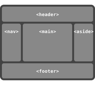
This layout can be easily achieved with grid layout:
body{ display : grid; grid : "h h h" "a b c" "f f f" ; grid-template-columns : auto1 fr 20 % ; } main{ grid-area : b; min-width : 12 em ; } nav{ grid-area : a; /* auto min-width */ } aside{ grid-area : c; min-width : 12 em ; }
As an added bonus, the columns will all be equal-height by default, and the main content will be as wide as necessary to fill the screen. Additionally, this can then be combined with media queries to switch to an all-vertical layout on narrow screens:
@media all and( max-width:60 em ) { /* Too narrow to support three columns */ body{ display : block; } }
In order to preserve the author’s intended ordering in all presentation modes, authoring tools—including WYSIWYG editors as well as Web-based authoring aids—must reorder the underlying document source and not use order or grid-placement properties to perform reordering unless the author has explicitly indicated that the underlying document order (which determines speech and navigation order) should be out-of-sync with the visual order.
Since most of the time, reordering should affect all screen ranges as well as navigation and speech order, the tool would match the resulting drag-and-drop visual arrangement by simultaneously reordering the DOM layer. In some cases, however, the author may want different visual arrangements per screen size. The tool could offer this functionality by using the grid-placement properties together with media queries, but also tie the smallest screen size’s arrangement to the underlying DOM order (since this is most likely to be a logical linear presentation order) while using grid-placement properties to rearrange the visual presentation in other size ranges.
This tool would be conformant, whereas a tool that only ever used the grid-placement properties to handle drag-and-drop grid rearrangement (however convenient it might be to implement it that way) would be non-conformant.
5. Grid Containers
5.1. Establishing Grid Containers: the grid and inline-grid display values
| Name: | display |
|---|---|
| New values: | grid | inline-grid |
- grid
- This value causes an element to generate a grid container box that is block-level when placed in flow layout.
- inline-grid
- This value causes an element to generate a grid container box that is inline-level when placed in flow layout.
A grid container that is not a subgrid establishes an independent grid formatting context for its contents. This is the same as establishing an independent block formatting context, except that grid layout is used instead of block layout: floats do not intrude into the grid container, and the grid container’s margins do not collapse with the margins of its contents. The contents of a grid container are laid out into a grid, with grid lines forming the boundaries of each grid items’ containing block.
Unlike those of a regular nested grid, a subgrid’s contents participate in its parent grid formatting context; thus a subgrid does not establish an independent formatting context.
Grid containers are not block containers, and so some properties that were designed with the assumption of block layout don’t apply in the context of grid layout. In particular:
- float and clear have no effect on a grid item. However, the float property still affects the computed value of display on children of a grid container, as this occurs before grid items are determined.
- vertical-align has no effect on a grid item.
- the ::first-line and ::first-letter pseudo-elements do not apply to grid containers, and grid containers do not contribute a first formatted line or first letter to their ancestors.
If an element’s specified display is inline-grid and the element is floated or absolutely positioned, the computed value of display is grid. The table in CSS 2.1 Chapter 9.7 is thus amended to contain an additional row, with inline-grid in the "Specified Value" column and grid in the "Computed Value" column.
5.2. Sizing Grid Containers
Note see [CSS-SIZING-3] for a definition of the terms in this section.
A grid container is sized using the rules of the formatting context in which it participates:
- As a block-level box in a block formatting context, it is sized like a block box that establishes a formatting context, with an auto inline size calculated as for non-replaced block boxes.
- As an inline-level box in an inline formatting context, it is sized as an atomic inline-level box (such as an inline-block).
In both inline and block formatting contexts, the grid container’s auto block size is its max-content size.
The block layout spec should probably define this, but it isn’t written yet.
The max-content size (min-content size) of a grid container is the sum of the grid container’s track sizes (including gutters) in the appropriate axis, when the grid is sized under a max-content constraint (min-content constraint).
5.3. Scrollable Grid Overflow
The overflow property applies to grid containers.
Just as it is included in intrinsic sizing (see § 5.2 Sizing Grid Containers), the grid is also included in a grid container’s scrollable overflow region.
Note: Beware the interaction with padding when the grid container is a scroll container: additional padding is defined to be added to the scrollable overflow rectangle as needed to enable place-content: end alignment of scrollable content. See CSS Overflow 3 § 2.2 Scrollable Overflow
5.4. Limiting Large Grids
Since memory is limited, UAs may clamp the possible size of the implicit grid to be within a UA-defined limit (which should accommodate lines in the range [-10000, 10000]), dropping all lines outside that limit. If a grid item is placed outside this limit, its grid area must be clamped to within this limited grid.
To clamp a grid area:
-
If the grid area would span outside the limited grid, its span is clamped to the last line of the limited grid.
-
If the grid area would be placed completely outside the limited grid, its span must be truncated to 1 and the area repositioned into the last grid track on that side of the grid.
.grid-item{ grid-row : 500 /1500 ; grid-column : 2000 /3000 ; }
Would end up being equivalent to:
.grid-item{ grid-row : 500 /1001 ; grid-column : 1000 /1001 ; }
6. Grid Items
Loosely speaking, the grid items of a grid container are boxes representing its in-flow contents.
Each in-flow child of a grid container becomes a