1. Introduction
This section is not normative.
CSS layout has several different concepts of automatic sizing that are used in various layout calculations.
This section defines some more precise terminology
to help connect the layout behaviors of this spec to the calculations used in other modules,
and some new keywords for the width and height properties
to allow authors to assign elements the dimensions resulting from these size calculations.
General sizing testsTests
This spec needs illustrations! See issue.
1.1. Module interactions
This module extends the width, height, min-width, min-height, max-width, max-height, and column-width features defined in [CSS2] chapter 10 and in [CSS3COL]
The definition of the box-sizing property in this module supersedes the one in [CSS-UI-3].
1.2. Value Definitions
This specification follows the CSS property definition conventions from [CSS2] using the value definition syntax from [CSS-VALUES-3]. Value types not defined in this specification are defined in CSS Values & Units [CSS-VALUES-3]. Combination with other CSS modules may expand the definitions of these value types.
In addition to the property-specific values listed in their definitions, all properties defined in this specification also accept the CSS-wide keywords as their property value. For readability they have not been repeated explicitly.
2. Terminology
Some key terminology related to coordinate axises and dimensions is defined in CSS Writing Modes 3 § 6 Abstract Box Terminology.
- size
-
A one- or two-dimensional measurement:
a block size and/or inline size;
alternatively a width and/or height.
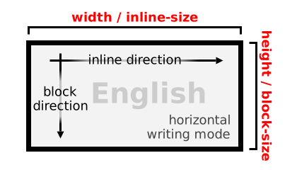

Whether the width or height corresponds to an inline size or block size depends on the writing mode. - inner size
-
The content-box size of a box.

Inner size - outer size
-
The margin-box size of a box.

Outer size - definite size
-
A size that can be determined without performing layout;
that is, a <length>,
a measure of text (without consideration of line-wrapping),
a size of the initial containing block,
or a <percentage> or other formula
(such the “stretch-fit” sizing of non-replaced blocks [CSS2])
that is resolved solely against definite sizes.
Additionally, the size of the containing block of an absolutely positioned element is always definite with respect to that element.
- indefinite size
-
A size that is not definite.
Indefinite available space is essentially infinite.
Note: intrinsic sizing keywords such as max-content are indefinite, even if they can be determined without laying out the children e.g. due to size containment or lack of children.
- available space
- A size representing the space into which a box is laid out, as determined by the rules of the formatting context in which it participates. The space available to a box is usually either a measurement of its containing block (if that is definite) or an infinite size (when it is indefinite). Available space can alternatively be either a min-content constraint or a max-content constraint, which forces boxes laid into it to be laid out under that constraint.
- stretch fit
-
The stretch fit into a given size
is that size,
minus the box’s computed margins (not collapsed, treating auto as zero),
border, and padding in the given dimension
(such that the outer size is a perfect fit),
and flooring at zero
(so that the inner size is not negative).
Note: This is the formula used to calculate the auto widths of non-replaced blocks in normal flow in CSS2.1§10.3.3.
- fallback size
- Some sizing algorithms do not work well with an infinite size. In these cases, the fallback size is used instead. Unless otherwise specified, this is the size of the initial containing block.
2.1. Auto Box Sizes
There are four types of automatically-determined sizes in CSS (sizes resulting from auto sizing rules, depending on context):
- stretch-fit size
- stretch-fit inline size
- stretch-fit block size
- stretch-fit inline size
-
The size a box would take
if its outer size filled the available space
in the given axis;
in other words, the stretch fit into the available space,
if that is definite.
Undefined if the available space is indefinite.
Note: For the inline axis, this is called the “available width” in CSS2.1§10.3.5 and computed by the rules in CSS2.1§10.3.3.
Note: Calculations involving this size need to specify a fallback behavior for when the available space is indefinite if that happens to be possible.
- max-content size
-
A box’s “ideal” size in a given axis when given infinite available space.
Usually this is the smallest size the box could take in that axis
while still fitting around its contents,
i.e. minimizing unfilled space while avoiding overflow.
- max-content inline size
-
The box’s “ideal” size in the inline axis. Usually the narrowest inline size it could take while fitting around its contents if none of the soft wrap opportunities within the box were taken. (See § 5 Intrinsic Size Determination.)
Note: This is called the “preferred width” in CSS2.1§10.3.5 and the “maximum cell width” in CSS2.1§17.5.2.2.
- max-content block size
-
The box’s “ideal” size in the block axis. Usually the block size of the content after layout.
- min-content size
-
Nominally, the smallest size a box could take
that doesn’t lead to overflow
that could be avoided by choosing a larger size.
Formally, the size of the box when sized under a min-content constraint,
see § 5 Intrinsic Size Determination.
- min-content inline size
-
The min-content size in the inline axis. Typically, the inline size that would fit around its contents if all soft wrap opportunities within the box were taken.
Note: This is called the “preferred minimum width” in CSS2.1§10.3.5 and the “minimum content width” in CSS2.1§17.5.2.2.
- min-content block size
-
The min-content size in the block axis. For block containers, tables, and inline boxes, this is equivalent to the max-content block size.
- fit-content size
- fit-content inline size
- fit-content block size
- fit-content inline size
-
If the available space in a given axis is definite,
equal to
clamp(min-content size, stretch-fit size, max-content size)(i.e.max(min-content size, min(max-content size, stretch-fit size))). When sizing under a min-content constraint, equal to the min-content size. Otherwise, equal to the max-content size in that axis.Note: This is called the “shrink-to-fit” width in CSS2.1§10.3.5 and CSS Multi-column Layout § 3.4.
- intrinsic size
-
A max-content size or min-content size,
i.e. a size arising primarily from the size of the content.
(Some uses of this term may refer also to sizes
derived primarily from one of these two sizes.)
Replaced elements frequently derive their intrinsic size from their natural dimensions.
2.2. Intrinsic Size Contributions
- max-content contribution
- The size that a box contributes to its containing block’s max-content size.
- min-content contribution
- The size that a box contributes to its containing block’s min-content size.
- intrinsic size contribution
- A max-content contribution, min-content contribution, or similarly-calculated content-based size contribution.
Intrinsic size contributions are based on the outer size of the box; for this purpose auto margins are treated as zero.
2.3. Intrinsic Size Constraints
- max-content constraint
- A sizing constraint imposed by the box’s containing block that causes it to produce its max-content contribution.
- min-content constraint
- A sizing constraint imposed by the box’s containing block that causes it to produce its min-content contribution.
- preferred aspect ratio
- A width:height ratio inherent to a box, which biases various sizing algorithms to produce a size consistent with that aspect ratio insofar as possible while honoring other sizing inputs. Unless otherwise specified, a box’s preferred aspect ratio is its natural aspect ratio if it has one and is applied to its content box. Most boxes do not have a preferred aspect ratio.
3. Specifying Box Sizes
3.1. Sizing Properties
This section defines the sizing properties width, height, min-width, min-height, max-width, and max-height. Their potential values are defined in the next section, § 3.2 Sizing Values: the <length-percentage [0,∞]>, auto | none, min-content, max-content, and fit-content() values.
Note: Additional flow-relative aliases to these properties are defined in [CSS-LOGICAL-1].
We would like to define shorthands for each pair of sizing properties (e.g. width and height) but there is a naming conflict with the @page size descriptor [CSS-PAGE-3], so this has been deferred to Level 4. Suggestions on how to resolve this problem are welcome, see discussion.
3.1.1. Preferred Size Properties: the width and height properties
| Name: | width, height |
|---|---|
| Value: | auto | <length-percentage [0,∞]> | min-content | max-content | fit-content(<length-percentage [0,∞]>) | <calc-size()> |
| Initial: | auto |
| Applies to: | all elements except non-replaced inlines |
| Inherited: | no |
| Percentages: | relative to width/height of containing block |
| Computed value: | as specified, with <length-percentage> values computed |
| Canonical order: | per grammar |
| Animation type: | by computed value type, recursing into fit-content() |
| Logical property group: | size |
Tests
- height-composition.html (live test) (source)
- height-interpolation.html (live test) (source)
- height-no-interpolation.html (live test) (source)
- width-composition.html (live test) (source)
- width-interpolation.html (live test) (source)
- percentage-height-replaced-content-in-auto-cb.html (live test) (source)
- height-invalid.html (live test) (source)
- height-valid.html (live test) (source)
- width-invalid.html (live test) (source)
- width-valid.html (live test) (source)
The width and height (physical) properties specify the preferred width and height of the box, respectively.
3.1.2. Minimum Size Properties: the min-width and min-height properties
| Name: | min-width, min-height |
|---|---|
| Value: | auto | <length-percentage [0,∞]> | min-content | max-content | fit-content(<length-percentage [0,∞]>) | <calc-size()> |
| Initial: | auto |
| Applies to: | all elements that accept width or height |
| Inherited: | no |
| Percentages: | relative to width/height of containing block |
| Computed value: | as specified, with <length-percentage> values computed |
| Canonical order: | per grammar |
| Animation type: | by computed value, recursing into fit-content() |
| Logical property group: | min-size |
Tests
- min-height-composition.html (live test) (source)
- min-height-interpolation.html (live test) (source)
- min-width-composition.html (live test) (source)
- min-width-interpolation.html (live test) (source)
- button-min-width.html (live test) (source)
- grid-item-image-percentage-min-height-computes-as-0.html (live test) (source)
- min-height-computed.html (live test) (source)
- min-height-invalid.html (live test) (source)
- min-height-valid.html (live test) (source)
- min-width-computed.html (live test) (source)
- min-width-invalid.html (live test) (source)
- min-width-valid.html (live test) (source)
The min-width and min-height properties specify the minimum width (or “min width”) and minimum height (or “min height”) of the box, respectively.
Note: The initial value of auto is new; in [CSS2] the initial value was zero.
3.1.3. Maximum Size Properties: the max-width and max-height properties
| Name: | max-width, max-height |
|---|---|
| Value: | none | <length-percentage [0,∞]> | min-content | max-content | fit-content(<length-percentage [0,∞]>) | <calc-size()> |
| Initial: | none |
| Applies to: | all elements that accept width or height |
| Inherited: | no |
| Percentages: | relative to width/height of containing block |
| Computed value: | as specified, with <length-percentage> values computed |
| Canonical order: | per grammar |
| Animation type: | by computed value, recursing into fit-content() |
| Logical property group: | max-size |
Tests
- max-height-composition.html (live test) (source)
- max-height-interpolation.html (live test) (source)
- max-width-composition.html (live test) (source)
- max-width-interpolation.html (live test) (source)
- block-image-percentage-max-height-inside-inline.html (live test) (source)
- image-percentage-max-height-in-anonymous-block.html (live test) (source)
- nested-flexbox-image-percentage-max-height-computes-as-none.html (live test) (source)
- max-height-computed.html (live test) (source)
- max-height-invalid.html (live test) (source)
- max-height-valid.html (live test) (source)
- max-width-computed.html (live test) (source)
- max-width-invalid.html (live test) (source)
- max-width-valid.html (live test) (source)
The max-width and max-height properties specify the maximum width (or “max width”) and maximum height (or “max height”) of the box, respectively.
3.2. Sizing Values: the <length-percentage [0,∞]>, auto | none, min-content, max-content, and fit-content() values
- <length-percentage [0,∞]>
-
Specifies the size of the box using <length> and/or <percentage>.
The box-sizing property indicates whether the content box or border box is measured.
Percentages are resolved against the width/height, as appropriate, of the box’s containing block. If, in a particular axis, the containing block’s size depends on the box’s size, see the relevant layout module for special rules on how to resolve percentages.
Negative values are invalid.
- auto
-
For width/height, specifies an automatic size
(automatic block size/automatic inline size).
See the relevant layout module for how to calculate this.
For min-width/min-height, specifies an automatic minimum size. Unless otherwise defined by the relevant layout module, however, it resolves to a used value of 0. For backwards-compatibility, the resolved value of this keyword is zero for boxes of all [CSS2] display types: block and inline boxes, inline blocks, and all the table layout boxes. It also resolves to zero when no box is generated.
- none
- No limit on the size of the box.
- min-content
-
Use the min-content size in the relevant axis;
for a box’s block size,
unless otherwise specified,
this is equivalent to its automatic size.
Tests
- clone-intrinsic-size.html (live test) (source)
- clone-nowrap-intrinsic-size-bidi.html (live test) (source)
- clone-nowrap-intrinsic-size.html (live test) (source)
- min-content-negative-margin-crash.html (live test) (source)
- replaced-max-height-min-content.html (live test) (source)
- replaced-max-size-saturation.html (live test) (source)
- replaced-max-width-min-content.html (live test) (source)
- replaced-min-height-min-content.html (live test) (source)
- replaced-min-width-min-content.html (live test) (source)
- shrink-to-fit-sizing-max-width-min-content.html (live test) (source)
- slice-intrinsic-size.html (live test) (source)
- slice-nowrap-intrinsic-size-bidi.html (live test) (source)
- slice-nowrap-intrinsic-size.html (live test) (source)
- svg-no-ar-max-height-min-content.html (live test) (source)
- svg-no-ar-min-height-min-content.html (live test) (source)
- max-content
- Use the max-content size in the relevant axis; for a box’s block size, unless otherwise specified, this is equivalent to its automatic size.
- fit-content(<length-percentage [0,∞]>)
-
Use the fit-content formula
with the available space replaced by the specified argument,
i.e.
min(max-content, max(min-content, <length-percentage>)), where the <length-percentage> argument is resolved exactly as for <length-percentage> values standing alone.Negative <length-percentage> values are invalid.
Tests
- auto-scrollbar-inside-stf-abspos.html (live test) (source)
- block-fit-content-as-initial.html (live test) (source)
- fit-content-length-percentage-001.html (live test) (source)
- fit-content-length-percentage-002.html (live test) (source)
- fit-content-length-percentage-003.html (live test) (source)
- fit-content-length-percentage-004.html (live test) (source)
- fit-content-length-percentage-005.html (live test) (source)
- fit-content-length-percentage-006.html (live test) (source)
- fit-content-length-percentage-007.html (live test) (source)
- fit-content-length-percentage-008.html (live test) (source)
- fit-content-length-percentage-009.html (live test) (source)
- fit-content-length-percentage-010.html (live test) (source)
- fit-content-length-percentage-011.html (live test) (source)
- fit-content-length-percentage-012.html (live test) (source)
- fit-content-length-percentage-013.html (live test) (source)
- fit-content-length-percentage-014.html (live test) (source)
- fit-content-length-percentage-015.html (live test) (source)
- fit-content-length-percentage-016.html (live test) (source)
- calc-size()
-
See <calc-size()>.
Note: The none keyword is not usable within calc-size().
Tests
- block-size-with-min-or-max-content-1a.html (live test) (source)
- block-size-with-min-or-max-content-1b.html (live test) (source)
- block-size-with-min-or-max-content-2.html (live test) (source)
- block-size-with-min-or-max-content-3.html (live test) (source)
- block-size-with-min-or-max-content-4.html (live test) (source)
- block-size-with-min-or-max-content-5.html (live test) (source)
- block-size-with-min-or-max-content-6.html (live test) (source)
- block-size-with-min-or-max-content-7.html (live test) (source)
- block-size-with-min-or-max-content-table-1a.html (live test) (source)
- block-size-with-min-or-max-content-table-1b.html (live test) (source)
- hori-block-size-small-or-larger-than-container-with-min-or-max-content-1.html (live test) (source)
- hori-block-size-small-or-larger-than-container-with-min-or-max-content-2a.html (live test) (source)
- hori-block-size-small-or-larger-than-container-with-min-or-max-content-2b.html (live test) (source)
- image-min-max-content-intrinsic-size-change-001.html (live test) (source)
- image-min-max-content-intrinsic-size-change-002.html (live test) (source)
- image-min-max-content-intrinsic-size-change-003.html (live test) (source)
- image-min-max-content-intrinsic-size-change-004.html (live test) (source)
- image-min-max-content-intrinsic-size-change-005.html (live test) (source)
- image-min-max-content-intrinsic-size-change-006.html (live test) (source)
- image-min-max-content-intrinsic-size-change-007.html (live test) (source)
- image-min-max-content-intrinsic-size-change-008.html (live test) (source)
- keyword-sizes-for-intrinsic-contributions.html (live test) (source)
- keyword-sizes-for-intrinsic-contributions-002.html (live test) (source)
- keyword-sizes-on-abspos.html (live test) (source)
- keyword-sizes-on-flex-item-001.html (live test) (source)
- keyword-sizes-on-flex-item-002.html (live test) (source)
- keyword-sizes-on-floated-element.html (live test) (source)
- keyword-sizes-on-inline-block.html (live test) (source)
- keyword-sizes-on-replaced-element.html (live test) (source)
- min-content-min-width-000.html (live test) (source)
- percentage-min-width.html (live test) (source)
- vert-block-size-small-or-larger-than-container-with-min-or-max-content-1.html (live test) (source)
- vert-block-size-small-or-larger-than-container-with-min-or-max-content-2a.html (live test) (source)
- vert-block-size-small-or-larger-than-container-with-min-or-max-content-2b.html (live test) (source)
In all cases, the used value is floored to preserve a non-negative inner size.
Note: The min-content, max-content, and fit-content() values are new in Level 3.
Note: The flex-basis property hereby also gains these new keywords, as its values are defined by reference to <width>.
Note: This section previously defined stretch and fit-content as keywords representing the stretch-fit size and fit-content size, respectively. These keywords have been deferred to Level 4 (along with an additional contain keyword that behaves similarly to stretch but preserves the preferred aspect ratio, if any) to better work out the implications in situations with indefinite available space.
3.2.1. “Behaving as auto”
To have a common term for both when width/height computes to auto and when it is defined to behave as if auto were specified (as in the case of block percentage heights resolving against an indefinite size, see CSS2§10.5), the property is said to behave as auto in both of these cases.
Note: Legacy spec prose defining layout behavior, particularly in [CSS2], might explicitly refer to width/height having a computed value of auto as a condition; some of these cases should be interpreted as meaning behaves as auto, and reported to the CSSWG for updating.
Tests
- margin-collapse-with-indefinite-block-size-001.html (live test) (source)
- margin-collapse-with-indefinite-block-size-002.html (live test) (source)
- margin-collapse-with-indefinite-block-size-003.html (live test) (source)
- margin-collapse-with-indefinite-block-size-004.html (live test) (source)
- margin-collapse-with-indefinite-block-size-005.html (live test) (source)
Replace this section with references to the new term automatic size.
3.2.2. Containing or Excluding Floats
This section is non-normative.
Although block box boundaries are typically pervious to floats, sometimes an author needs them to contain their own (descendant) floats or to exclude floats from outside. For Block layout, specifying display: flow-root will make the box a formatting context root, which has this behavior.
Note: Boxes participating in Flex, Grid, or Table layout will automatically have this behavior.
3.3. Box Edges for Sizing: the box-sizing property
| Name: | box-sizing |
|---|---|
| Value: | content-box | border-box |
| Initial: | content-box |
| Applies to: | all elements that accept width or height |
| Inherited: | no |
| Percentages: | N/A |
| Computed value: | specified keyword |
| Canonical order: | per grammar |
| Animation type: | discrete |