
An 'M' inside an Em box (blue square). The 'M' sits on the baseline (blue line). The origin of the coordinate system is shown by the small black circle.
Text that is to be rendered as part of an SVG document fragment is specified using the ‘text’ element. The text within a ‘text’ element can be rendered:
The section Text layout gives an introduction to text layout. It is followed by sections covering content areas and the algorithm for laying out text within a content area. The specialized layout rules corresponding to text that is pre-formatted, auto-wrapped, and on a path are then addressed in individual sections.
Rules for text layout in SVG 1.1 are mostly defined within the SVG 1.1 specification. The rules mirror to a large extent those found in CSS. In SVG 2, the dependence on CSS is more explicit. In practice the resulting layout is the same. The change to directly relying on CSS specifications simplifies the SVG specification while making it more obvious that rendering agents can use the same code to render both text in HTML and in SVG. In particular, SVG 2 auto-wrapped text is based on CSS text layout.
SVG's ‘text’ elements are rendered like other graphics elements. Thus, coordinate system transformations, painting, clipping and masking features apply to ‘text’ elements in the same way as they apply to shapes such as paths and rectangles.
SVG text supports advanced typographic features including:
SVG text supports international text processing needs such as:
Multi-language SVG content is possible by substituting different text strings based on the user's preferred language.
The characters to be drawn are expressed as character data ([xml], section 2.4) inside the ‘text’ element. As a result:
For accessibility reasons, it is recommended that text that is included in a document have appropriate semantic markup to indicate its function. For example, a text element that provides a visible label for part of a diagram should have an ‘id’ that is referenced by an ‘aria-labelledby’ attribute on the relevant group or path element. See SVG accessibility guidelines for more information.
Essentially, a Unicode code point. A character may be a control instruction (such as a tab, carriage return, or line feed), a renderable mark (letter, digit, punctuation or other symbol), or a modifier (such as a combining accent).
The different methods are backwards compatible with SVG 1.1. The use of UTF-16 code units for SVG DOM text methods is required from the definition of DOMString in the DOM 2 specification.
The SVG working group is interested in implementer feedback on the possibility of using grapheme clusters as defined by the Unicode Standard Annex #29 to replace Unicode code points in mapping text positioning attributes. Note, the use of the CSS typographic character is not appropriate as what constitutes a character can depend on context (line-breaking, word-breaking, etc.).
If support for CSS generated-content text is introduced in the future, it would be included in the array of addressable characters.
Although various CSS 3 text layout specs use the term, none current establish a formal definition. The link is therefore to CSS 2.1, and an issue has been filed with CSS WG.
startand
endsides of a line or part of a line of text (relevant, for example to how the text-anchor property is applied). It is determined by the direction property. (Note: the ordering of characters in a line of text is primary controlled by the Unicode bidi algorithm and not the inline-base direction.)
A font consists of a collection of glyphs together with other information (collectively, the font tables) necessary to use those glyphs to present characters on some visual medium. The combination of the collection of glyphs and the font tables is called the font data.
A font may supply substitution and positioning tables that can be used by a formatter (text shaper) to re-order, combine and position a sequence of glyphs to form one or more composite glyphs. The combining may be as simple as a ligature, or as complex as an indic syllable which combines, usually with some re-ordering, multiple consonants and vowel glyphs. The tables may be language dependent, allowing the use of language appropriate letter forms.
When a glyph, simple or composite, represents an indivisible unit for typesetting purposes, it is know as a typographic character.
Ligatures are an important feature of advance text layout. Some ligatures are discretionary while others (e.g. in Arabic) are required. The following explicit rules apply to ligature formation:
Ligature formation should not be enabled when characters are in different DOM text nodes; thus, characters separated by markup should not use ligatures.
Ligature formation should not be enabled when characters are in different text chunks.
Discretionary ligatures should not be used when the spacing between two characters is not the same as the default space (e.g. when letter-spacing has a non-default value, or text-align has a value of justify and text-justify has a value of distribute). (See CSS Text Module Level 3, ([css-text-3]).
SVG attributes such as ‘dx’, ‘textLength’, and ‘spacing’ (in ‘textPath’) that may reposition typographic characters do not break discretionary ligatures. If discretionary ligatures are not desired they can be turned off by using the font-variant-ligatures property.
For OpenType fonts, discretionary ligatures include those enabled by the liga, clig, dlig, hlig, and cala features; required ligatures are found in the rlig feature.
| SVG 2 Requirement: | Include explicit support for Web Open Font Format (WOFF). |
|---|---|
| Resolution: | We will mandate WOFF support in SVG 2. |
| Purpose: | To allow access to full OpenType features for internationalization and advanced typography. |
| Owner: | Chris (no action) |
| Status: | Done |
Proper text rendering may depend on using the same font as used during authoring. For this reason SVG requires support for downloadable fonts as defined in the Font Resources section of the CSS Fonts Module. In particular, support for the Web Open Font Format [WOFF] is required.
New in SVG 2, WOFF allows authors to provide the fonts needed to properly render their content. This includes ensuring that the fonts have the proper OpenType tables to support complex scripts, discretionary ligatures, swashes, old-style numbers, and so on. WOFF also allows the fonts to be compressed, subsetted, and include licensing information.
Glyph selection and positioning is normally handled according to the rules of CSS. In some cases, however, the final layout of text in SVG requires knowledge of the geometry properties of individual glyphs.
The geometric font characteristics are expressed in a coordinate system based on the EM box. (The EM is a relative measure of the height of the glyphs in the font.) The box 1 EM high and 1 EM wide is called the design space. This space is given a geometric coordinates by sub-dividing the EM into a number of units per em.
Units per em is a font characteristic. A typical value for units per em is 1000 or 2048.
The coordinate space of the EM box is called the design space coordinate system. For scalable fonts, the curves and lines that are used to draw a glyph are represented using this coordinate system.
Most often, the (0,0) point in this coordinate system is positioned on the left edge of the EM box, but not at the bottom left corner. The Y coordinate of the bottom of a roman capital letter is usually zero. The descenders on lowercase roman letters have negative coordinate values.
An 'M' inside an Em box (blue square). The 'M' sits on the baseline (blue line). The origin of the coordinate system is shown by the small black circle.
SVG assumes that the font tables will provide at least three font characteristics: an ascent, a descent and a set of baseline-tables. The ascent is the distance to the top of the EM box from the (0,0) point of the font; the descent is the distance to the bottom of the EM box from the (0.0) point of the font. The baseline-table is explained below.
Within an OpenType font ([OPENTYPE]), for horizontal writing-modes, the ascent and descent are given by the sTypoAscender and sTypoDescender entries in the OS/2 table. For vertical writing-modes, the descent (the distance, in this case from the (0,0) point to the left edge of the glyph) is normally zero because the (0,0) point is on the left edge. The ascent for vertical writing-modes is either 1 em or is specified by the ideographic top baseline value in the OpenType Base table for vertical writing-modes.
Glyphs are positioned relative to a particular point on each glyph known as the alignment point. For horizontal writing-modes, the glyphs' alignment points are vertically aligned while for vertical writing-modes, they are horizontally aligned. The position of the alignment point depends on the script. For example, Western glyphs are aligned at the bottom of capital letters, northern Indic glyphs are aligned at the top of a horizontal stroke near the top of the glyphs, and far-eastern glyphs are aligned either at the bottom or center of the glyph.
Within a script and within a line of text having a single font-size, the sequence of alignment points defines, in the inline-base direction, a geometric line called a baseline. Western and most other alphabetic and syllabic glyphs are aligned to an "alphabetic" baseline, the northern Indic glyphs are aligned to a "hanging" baseline and the far-eastern glyphs are aligned to an "ideographic" baseline.

Example baselines (red lines) in three different scripts. From left to right: alphabetic, hanging, ideographic. The EM box is shown in blue for the ideographic script.
As glyphs are sequentially placed along a baseline, the alignment point of a glyph is typically positioned at the current text position (some properties such as vertical-align may alter the positioning). After each glyph is placed, the current text position is advanced by the glyph's advance value (typically the width for horizontal text or height for vertical text) with any correction for kerning or other spacing adjustment as well as for new lines in pre-formatted or auto-wrapped text. The initial and final current text positions are used for alignment (e.g. when the text-anchor value is either 'middle' or 'end'). The glyph's advance is needed when placing text along a path.

Example of font metrics. The blue boxes show the geometric boxes for the three glyphs. The labeled small circles show the current text position before glyph placement. The small square shows the final current text position after placing the last glyph. Note that the left side of the 'a' glyph's box is not aligned with the right side of the 'V' glyph's box due to kerning.
If a glyph does not provide explicit advance values corresponding to the current glyph orientation, then an appropriate approximation should be used. For vertical text, a suggested approximation is the em size.
The initial current text position is established by the ‘x’ and ‘y’ attributes on the ‘text’ element or first rendered ‘tspan’ element for pre-formatted text, or auto-wrapped text when the content area is determined by the inline-size property. For other auto-wrapped text, the initial current text position is determined by the position of the first rendered glyph after applying the CSS line wrapping algorithm.
A baseline-table specifies the position of one or more baselines in the design space coordinate system. The function of the baseline table is to facilitate the alignment of different scripts with respect to each other when they are mixed on the same text line. Because the desired relative alignments may depend on which script is dominant in a line (or block), there may be a different baseline table for each script. In addition, different alignment positions are needed for horizontal and vertical writing modes. Therefore, the font may have a set of baseline tables: typically, one or more for horizontal writing-modes and zero or more for vertical writing-modes.
Some fonts may not have values for the baseline tables. Heuristics are suggested for approximating the baseline tables in CSS Inline Layout Module Level 3 [css-inline-3] when a given font does not supply baseline tables.
When a different font (or change in font size) is specified in the middle of a run of text, the dominant baseline determines the baseline used to align glyphs in the new font (new size) to those in the previous font. The dominant-baseline property is used to set the dominant baseline.
Alignment between an object relative to its parent is determined by the alignment baseline. It is normally the same baseline as the dominant baseline but by using the shorthand vertical-align property (preferred) or the longhand alignment-baseline another baseline can be chosen.
The dominant baseline can be temporarily shifted (as needed for superscripts or subscripts) by using either the shorthand vertical-align property (preferred) or the longhand baseline-shift property. Note that shifts can be nested, each shift added to the previous shift.
![Examples of using the 'vertical-align' property. Left shows '[[z]]' where the inner brackets are smaller. Right shows 'x2' where the '2' is a superscript.](https://proxy.086236.xyz/https%3A%2F%2Fsvgwg.org%2Fsvg2-draft%2Fimages%2Ftext%2Fvertical_align.svg)
Examples of using the 'vertical-align' property. Left: 'vertical-align:mathematical' ('alignment-baseline:mathematical') is applied to the ‘tspan’ containing '[z]'. The light-blue line shows the position of the mathematical baseline. Right: 'vertical-align:super' ('baseline-shift:super') applied to the ‘tspan’ containing '2'. The light-blue lines indicate the shift in baseline.
SVG further assumes that for each glyph in the font data for a font, there are two width values, two alignment-baselines and two alignment points, one each for horizontal writing-modes and the other for vertical writing-modes. (Even though it is specified as a width, for vertical writing-modes the width is used in the vertical direction.) The inline-base direction position of the alignment point is on the start-edge of the glyph.
Additional information on baselines can be found in the CSS Inline Layout Module Level 3 specification. [css-inline-3] (Also see: CSS Writing Modes Level 3 specification. [css-writing-modes-3])
| SVG 2 Requirement: | Support text aligned to different baselines. |
|---|---|
| Resolution: | SVG 2 will support glyphs being aligned to different baselines, perhaps by using existing or improved CSS properties. |
| Purpose: | To allow glyphs in horizontal text to have different vertical alignments for stylistic effects. |
| Owner: | Chris (no action) |
| Status: | Done |
A single line of text is laid out inside a line box. Multi-line text is produced by stacking these boxes. The height of a line box is determined by finding the maximum ascent and the maximum descent of all the glyphs in a line of text after applying the effect of the line-height property. The width of a line box is normally the width of the containing text block. In SVG, when the containing text block does not have a fixed geometry (as with pre-formatted text), the line box tightly wraps the glyph boxes within the box.

Example of determining the height of a line box. First each glyph box (small light-blue boxes) is extended vertically above and below according to the line-height property. In this case the line-height property is 125%. The larger glyphs have a font-size of 96px so their extra height is 24px (25% of 96px). The extra height is evenly divided above and below resulting in the red boxes. (For clarity, all glyphs in the same inline element have been grouped together). The final line box (large light-blue box) is then found using the maximum extents of the red boxes above and below the baseline.
In order to support various international writing systems, line boxes may be orientated in a horizontal or vertical direction. Text within a vertical line box flows from top to bottom. Text within a horizontal line box may flow left-to-right (e.g., modern Latin scripts), right-to-left (e.g., Hebrew or Arabic), or a mixture of left-to-right and right-to-left (bidirectional text).
The processing model for bidirectional text is as follows:
While kerning or ligature processing might be font-specific, the preferred model is that kerning and ligature processing occurs between combinations of characters or glyphs after the characters have been re-ordered.
The orientation of line boxes as well as the direction in which they are stacked (block-flow direction) is determined by the writing-mode property. For horizontal text (writing-mode value horizontal-tb) line boxes are stacked from top to bottom. For vertical text, line boxes are stacked from right-to-left (writing-mode value vertical-rl) or left-to-right (writing-mode value vertical-lr).
The ‘text’ element defines a graphics element consisting of text. The ‘tspan’ element within a ‘text’ or another ‘tspan’ element, allows one to switch the style and/or adjust the position of the rendered text inside the ‘tspan’ element relative to the parent element.
The character data within the ‘text’ and ‘tspan’ elements, along with relevant attributes and properties, and character-to-glyph mapping tables within the font itself, define the glyphs to be rendered. The attributes and properties on the ‘text’ and ‘tspan’ elements indicate such things as the writing direction, font specification, and painting attributes which describe how exactly to render the characters. Subsequent sections of this chapter describe the relevant text-specific attributes and properties.
Since ‘text’ and ‘tspan’ elements are rendered using the same rendering methods as other graphics elements, all of the same painting features that apply to shapes such as paths and rectangles also apply to ‘text’ and ‘tspan’ elements, except for markers. In addition, coordinate system transformations, clipping, and masking can be applied to the ‘text’ element as a whole.
In CSS terms, the ‘text’ element acts as a block element. The ‘tspan’, ‘textPath’, and ‘a’ elements that are descended from text content elements act as inline elements.
It is possible to apply a gradient, pattern, clipping path, mask or filter to text. When one of these facilities is applied to text and keyword 'objectBoundingBox' is used (see Object bounding box units) to specify a graphical effect relative to the "object bounding box", then the object bounding box units are computed relative to the entire ‘text’ element in all cases, even when different effects are applied to different ‘tspan’ or ‘textPath’ elements within the same ‘text’ element.
The ‘text’ element renders its first glyph (after bidirectionality reordering) at the initial current text position (with possible adjustments due to the value of the text-anchor property or the text-align property). For pre-formatted text and for auto-wrapped text where the content area is determined by the inline-size property, the initial current text position is determined by the ‘x’ and ‘y’ values of the ‘text’ or ‘tspan’ element which contains the first rendered character. For auto-wrapped text in a shape or text on a path see the Auto-wrapped text or Text on a path sections, respectively, to determine the initial current text position. After the glyph(s) corresponding to the given character is (are) rendered, the current text position is updated for the next character. In the simplest case, the new current text position is the previous current text position plus the glyphs' advance value (horizontal or vertical). See text layout for a description of glyph placement and glyph advance.
The text string Hello, out there!
is rendered onto the
canvas using the Verdana font family with the glyphs filled
with the color blue.
<?xml version="1.0" standalone="no"?>
<svg width="10cm" height="3cm" viewBox="0 0 1000 300"
     xmlns="http://www.w3.org/2000/svg" version="1.1">

  <text x="250" y="180"
        font-family="Verdana" font-size="64" fill="blue" >
    Hello, out there!
  </text>

</svg>

A ‘tspan’ is used to change the styling of the word not
.
<?xml version="1.0" standalone="no"?>
<svg width="10cm" height="3cm" viewBox="0 0 1000 300"
     xmlns="http://www.w3.org/2000/svg" version="1.1">

  <g font-family="Verdana" font-size="64" >
    <text x="160" y="180" fill="blue" >
      You are
      <tspan font-weight="bold" fill="red" >not</tspan>
      a banana.
    </text>
  </g>

</svg>

Two ‘tspan’ elements are repositioned horizontally and vertically using the ‘x’ and ‘y’ attributes. Because all the text is within a single ‘text’ element, a user will be able to select through all the text and copy it to the system clipboard in user agents that support text selection and clipboard operations.
<?xml version="1.0" standalone="no"?>
<svg width="10cm" height="3cm" viewBox="0 0 1000 300"
     xmlns="http://www.w3.org/2000/svg" version="1.1">

  <g font-family="Verdana" font-size="64" >
    <text x="100" y="180" fill="blue" >
      But you
      <tspan dx="2em" dy="-50" font-weight="bold" fill="red" >
        are
      </tspan>
      <tspan dy="100">
        a peach!
      </tspan>
    </text>
  </g>

</svg>

| SVG 2 Requirement: | Allow transforms on ‘tspan’. |
|---|---|
| Resolution: | SVG 2 will allow transforms on ‘tspan’. |
| Purpose: | Align with other elements such as ‘a’ which already allow transforms. |
| Owner: | Cameron (no action) |
| Status: | Done |
This decision was reversed. See GitHub Issue 210. CSS/HTML does not allow transforms on inline elements and no renderer supports transforms on the ‘a’ element when inline (in both SVG and HTML).
| Name | Value | Initial value | Animatable |
|---|---|---|---|
| x, y | [ [ <length-percentage> | <number> ]+ ]# | 0 for ‘text’; (none) for ‘tspan’ |
yes |
If a single <length> is provided, then the value represents the new absolute X (Y) coordinate for the current text position for rendering the glyphs that correspond to the first character within this element or any of its descendants.
If a comma- or space-separated list of n <length>s is provided, then the values represent new absolute X (Y) coordinates for the current text position for rendering the glyphs corresponding to each of the first n addressable characters within this element or any of its descendants.
If more <length>s are provided than characters, then the extra <length>s will have no effect on glyph positioning.
If more characters exist than <length>s, or if the attribute is not specified on a ‘tspan’, then for each additional character:
In SVG 2, the ‘text’ and ‘tspan’ ‘x’ and ‘y’ attributes are not presentation attributes and cannot be set via CSS. This may change in a future version of SVG.
| Name | Value | Initial value | Animatable |
|---|---|---|---|
| dx, dy | [ [ <length-percentage> | <number> ]+ ]# | (none) | yes |
If a single <length> is provided, this value represents the new relative X (Y) coordinate for the current text position for rendering the glyphs corresponding to the first character within this element or any of its descendants. The current text position is shifted along the x-axis (y-axis) of the current user coordinate system by <length> before the first character's glyphs are rendered.
If a comma- or space-separated list of n <length>s is provided, then the values represent incremental shifts along the x-axis (y-axis) for the current text position before rendering the glyphs corresponding to the first n addressable characters within this element or any of its descendants. Thus, before the glyphs are rendered corresponding to each character, the current text position resulting from drawing the glyphs for the previous character within the current ‘text’ element is shifted along the x-axis (y-axis) of the current user coordinate system by <length>.
If more <length>s are provided than characters, then any extra <length>s will have no effect on glyph positioning.
If more characters exist than <length>s, or if the attribute is not specified, then for each additional character:
| Name | Value | Initial value | Animatable |
|---|---|---|---|
| rotate | [ <number>+ ]# | (none) | yes (non-additive). |
The supplemental rotation, in degrees, about the current text position that will be applied to all of the glyphs corresponding to each character within this element.
If a comma- or space-separated list of <number>s is provided, then the first <number> represents the supplemental rotation for the glyphs corresponding to the first character within this element or any of its descendants, the second <number> represents the supplemental rotation for the glyphs that correspond to the second character, and so on.
If more <number>s are provided than there are characters, then the extra <number>s will be ignored.
If more characters are provided than <number>s, then for each of these extra characters the rotation value specified by the last number must be used.
If the attribute is not specified and if an ancestor of a ‘tspan’ element specifies a supplemental rotation for a given character via a ‘rotate’ attribute (nearest ancestor has precedence), then the given supplemental rotation is applied to the given character. If there are more characters than <number>s specified in the ancestor's ‘rotate’ attribute, then for each of these extra characters the rotation value specified by the last number must be used.
This supplemental rotation has no impact on the rules by which current text position is modified as glyphs get rendered and is supplemental to any rotation due to text on a path and to text-orientation, glyph-orientation-horizontal, or glyph-orientation-vertical.
| Name | Value | Initial value | Animatable |
|---|---|---|---|
| textLength | <length-percentage> | <number> | See below | yes |
The author's computation of the total sum of all of the advance values that correspond to character data within this element, including the advance value on the glyph (horizontal or vertical), the effect of properties letter-spacing and word-spacing and adjustments due to attributes ‘dx’ and ‘dy’ on this ‘text’ or ‘tspan’ element or any descendants. This value is used to calibrate the user agent's own calculations with that of the author.
The purpose of this attribute is to allow the author to achieve exact alignment, in visual rendering order after any bidirectional reordering, for the first and last rendered glyphs that correspond to this element; thus, for the last rendered character (in visual rendering order after any bidirectional reordering), any supplemental inter-character spacing beyond normal glyph advances are ignored (in most cases) when the user agent determines the appropriate amount to expand/compress the text string to fit within a length of ‘textLength’.
If attribute ‘textLength’ is specified on a given element and also specified on an ancestor, the adjustments on all character data within this element are controlled by the value of ‘textLength’ on this element exclusively, with the possible side-effect that the adjustment ratio for the contents of this element might be different than the adjustment ratio used for other content that shares the same ancestor. The user agent must assume that the total advance values for the other content within that ancestor is the difference between the advance value on that ancestor and the advance value for this element.
This attribute is not intended for use to obtain effects such as shrinking or expanding text.
A negative value is an error (see Error processing).
The ‘textLength’ attribute is only applied when the wrapping area is not defined by the shape-inside or the inline-size properties. It is also not applied for any ‘text’ or ‘tspan’ element that has forced line breaks (due to a white-space value of pre or pre-line).
If the attribute is not specified anywhere within a ‘text’ element, the effect is as if the author's computation exactly matched the value calculated by the user agent; thus, no advance adjustments are made. For the purpose of reflecting the attribute in the DOM, the initial value is the current user-agent calculated length, expressed in implicit user units.
| Name | Value | Initial value | Animatable |
|---|---|---|---|
| lengthAdjust | spacing | spacingAndGlyphs | spacing | yes |
The user agent is required to achieve correct start and end positions for the text strings, but the locations of intermediate glyphs are not predictable because user agents might employ advanced algorithms to stretch or compress text strings in order to balance correct start and end positioning with optimal typography.
Note that, for a text string that contains n characters, the adjustments to the advance values often occur only for n−1 characters (see description of attribute ‘textLength’), whereas stretching or compressing of the glyphs will be applied to all n characters.
The ‘x’, ‘y’, ‘dx’, ‘dy’, and ‘rotate’ on the ‘text’ and ‘tspan’ elements are useful in high-end typography scenarios where individual glyphs require exact placement. These attributes are useful for minor positioning adjustments between characters or for major positioning adjustments, such as moving a section of text to a new location to achieve the visual effect of a new line of text (compatible with SVG 1.1). Note that the ‘x’, ‘y’, ‘dx’, ‘dy’, and ‘rotate’ attributes are ignored for auto-wrapped text (except for the initial current text position when the content area is specified by the inline-size property).
It was decided at the 2015 Sydney F2F that 'dx', 'dy', and 'rotate' would be ignored for auto-wrapped text. (Technically, it is not difficult to apply them but it was not seen as being really useful.)
In situations where micro-level positioning adjustment are necessary for advanced typographic control, the SVG content designer needs to ensure that the necessary font will be available for all viewers of the document (e.g., package up the necessary font data in the form of an SVG font or an alternative WebFont format which is stored at the same Web site as the SVG content) and that the viewing software will process the font in the expected way (the capabilities, characteristics and font layout mechanisms vary greatly from system to system). If the SVG content contains ‘x’, ‘y’, ‘dx’, or ‘dy’ attribute values which are meant to correspond to a particular font processed by a particular set of viewing software and either of these requirements is not met, then the text might display with poor quality.
The following additional rules apply to attributes ‘x’, ‘y’, ‘dx’, ‘dy’, and ‘rotate’ when they contain a list of numbers:
<tspan dx="11 12 13 14 15 0 21 22 23 0 31 32 33 34 35 36">Latin and Hebrew</tspan>Example tspan04 uses the ‘rotate’ attribute on the ‘tspan’ element to rotate the glyphs to be rendered. This example shows a single text string in a ‘tspan’ element that contains more characters than the number of values specified in the ‘rotate’ attribute. In this case the last value specified in the ‘rotate’ attribute of the ‘tspan’ must be applied to the remaining characters in the string.
<?xml version="1.0" standalone="no"?>
<svg width="10cm" height="3cm" viewBox="0 0 1000 300"
  xmlns="http://www.w3.org/2000/svg" version="1.1">
  <desc>
    Example tspan04 - The number of rotate values is less than the number of
    characters in the string.
  </desc>
  <text font-family="Verdana" font-size="55" fill="blue" >
    <tspan x="250" y="150" rotate="-30,0,30">
      Hello, out there
    </tspan>
  </text>
  <!-- Show outline of viewport using 'rect' element -->
  <rect x="1" y="1" width="998" height="298"
  fill="none" stroke="blue" stroke-width="2" />
</svg>
Example tspan04
Example tspan05 specifies the ‘rotate’ attribute on the ‘text’ element and on all but one of the child ‘tspan’ elements to rotate the glyphs to be rendered. The example demonstrates the propagation of the ‘rotate’ attribute.
<?xml version="1.0" standalone="no"?>
<svg width="100%" height="100%" viewBox="0 0 500 120"
  xmlns="http://www.w3.org/2000/svg" version="1.1">
  <desc>
    Example tspan05 - propagation of rotation values to nested tspan elements.
  </desc>
  <text id="parent" font-family="Arial, sans-serif" font-size="32" fill="red" x="40" y="40"
    rotate="5,15,25,35,45,55">
    Not

    <tspan id="child1" rotate="-10,-20,-30,-40" fill="orange">
      all characters

      <tspan id="child2" rotate="70,60,50,40,30,20,10" fill="yellow">
        in

        <tspan id="child3">
          the
        </tspan>
      </tspan>

      <tspan id="child4" fill="orange" x="40" y="90">
        text
      </tspan>

      have a
    </tspan>

    <tspan id="child5" rotate="-10" fill="blue">
      specified
    </tspan>

    rotation
  </text>

  <!-- Show outline of viewport using 'rect' element -->
  <rect x="1" y="1" width="498" height="118" fill="none"
        stroke="blue" stroke-width="2" />
</svg>
Example tspan05
Rotation of red text inside the ‘text’ element:
Rotation of the orange text inside the "child1" ‘tspan’ element:
Rotation of the yellow text inside the "child2" ‘tspan’ element:
Rotation of the blue text inside the "child5" ‘tspan’ element:
The following diagram illustrates how the rotation values propagate to ‘tspan’ elements nested withing a ‘text’ element:

| SVG 2 Requirement: | Include text layout improvements from SVG Tiny 1.2. |
|---|---|
| Resolution: | SVG 2 will include the improved text from SVG Tiny 1.2 on characters and glyphs, text layout, text selection, text search. |
| Purpose: | To include clearer descriptions of text layout; no functional change. |
| Owner: | Chris (ACTION-3236) |
| SVG 2 Requirement: | Support text in shapes. |
|---|---|
| Resolution: | SVG 2 will require automatic text wrapping compatible with CSS. |
| Purpose: | Text in flow charts, etc. |
| Owner: | Tav (no action) |
This section gives a short overview of SVG text layout. It is followed by sections that cover different aspects of text layout in more detail.
Text layout in SVG is a multi-stage process that takes as input a ‘text’ element subtree and its property values and produces a sequence of glyphs to render and their positions in each text content element's coordinate system.
First, a ‘text’ element and its descendants are laid out inside a content area or wrapping area according to CSS, as if the ‘text’ were a block element and any ‘tspan’, ‘textPath’, and ‘a’ descendants were inline elements. This layout takes into account all paragraph level and font related CSS properties described in this chapter.
The content area may be explicitly declared by setting the inline-size property, or by setting the shape-inside property that defines or references an SVG shape. If a content area is not declared, it defaults to a rectangle of infinite width and height.
Second, any positioning given by ‘x’, ‘y’, ‘dx’ and ‘dy’ attributes are applied to the resulting glyph positions from the CSS layout process. The rules for which transforms are allowed depend on if the content area was explicitly declared or not. If not explicitly declared, the rules define the layout of pre-formatted text. If declared, the rules define the layout of auto-wrapped text.
Third, the effect of the text-anchor property is applied if necessary.
Finally, layout of glyphs for any ‘textPath’ elements is performed, converting pre-formatted text to text-on-a-path.
Examples of the different types of text layout:
An example of multi-line pre-formatted text.
<svg xmlns="http://www.w3.org/2000/svg"
     width="300" height="100" viewBox="0 0 300 100">

     <text x="20" y="45" style="font: 24px sans-serif;">
       Example of multi-line,
       <tspan x="20" y="75">pre-formatted text.</tspan>
     </text>

</svg>

Pre-formatted text where a ‘tspan’ element has been used to create multi-line text.
An example of auto-wrapped text.
<svg xmlns="http://www.w3.org/2000/svg"
     width="300" height="100" viewBox="0 0 300 100">

  <text x="20" y="45" style="font: 24px sans-serif; inline-size: 250px;">
    Example of text auto-wrapped.</text>

</svg>

Auto-wrapped text. The inline-size property defines a rectangular content area of infinite height (shown in light blue).
An example of text on a path.
<svg xmlns="http://www.w3.org/2000/svg"
     width="300" height="100" viewBox="0 0 300 100">

  <path id="MyPath" stroke="lightblue" fill="none"
	d="M 50,50 C 100,0 200,100 250,50"/>

  <text style="font: 24px sans-serif;">
    <textPath href="#MyPath">Text on a path.</textPath>
  </text>

</svg>
SVG 2 introduces the ability to automatically wrap text inside a rectangle or other shape by specifying a content area. The design of SVG wrapped text is motivated by the desire that SVG text wrapping be as compatible as possible with text wrapping in CSS in order that renderers that support CSS text wrapping can implement SVG text wrapping easily (but without requiring non-HTML compatible SVG renderers to implement HTML). There are several differences between SVG and CSS text wrapping. The most important is that in SVG, a content area must be explicitly provided as SVG does not have an automatic finite (or semi-finite) content area (provided in CSS by the box model). Another difference is that SVG does not have the <p></p> and <br/> elements which create line breaks. Instead, SVG relies on the pre and pre-line values of white-space to provide line breaks. SVG wrapped text also allows a content-creation tool to provide a natural fallback for SVG 1.1 renderers that do not support wrapped text (by use of ‘x’ and ‘y’ attributes in the ‘text’ and ‘tspan’ elements, which are ignored by SVG 2 renderers for auto-wrapped text).
SVG's text layout options are designed to cover most general use cases. If more complex layout is required (bulleted lists, tables, etc.), text can be rendered in another XML namespace such as XHTML [HTML] embedded inline within a ‘foreignObject’ element.
A content area is defined by specifying in a ‘text’ element an inline-size property, or a shape-inside property that defines or references an SVG shape. If no content area is provided, the content area defaults to a rectangle of infinite width and height (see the pre-formatted text section). If both an inline-size property and a shape-inside property with value other than 'none' are given, the shape-inside property is used.
Wrapped text is laid out in a wrapping area. The wrapping area is normally the same as the content area. When the content area is defined using the shape-inside property, the wrapping area may be smaller due to the presence of a shape-subtract property and/or a shape-padding property. The shape-subtract property (along with the shape-margin property) defines a wrapping context. The wrapping area is found by insetting the content area by the shape-padding distance, and then subtracting the wrapping context.
Once a wrapping area is defined, the text is laid out inside the wrapping area according to the rules of CSS (respecting any special rules given in this section).
Constructing equivalent wrapping areas in SVG and HTML. The text inside the wrapping areas is rendered the same in both cases.

Defining a wrapping area in SVG. The ‘text’ element has both a shape-inside property and a shape-subtract property. The shape-inside property references a circle that defines a content area (dotted purple line). The shape-subtract property referencing two semicircles defines a wrapping context (dotted green line) which when subtracted from the content area results in the wrapping area (light blue line).

Defining a wrapping area in HTML.
A wrapper
<div> contains two float
<div>s. The wrapper <div> defines a rectangular
region (solid purple line). Its shape-inside property
defines a content area within the <div> (dotted
purple line). The two other <div>s define two floats,
one on the left (solid green line) and the right (solid pink
line). The floats are rectangular in shape. Each float has a
shape-outside property which defines the
wrapping context for each float (dotted green and pink
lines). The combined wrapping context is subtracted
from the content area to defined the
wrapping area (light blue line).
'extent' added by resolution from February 12th, 2015. 'extent' replaces the 'width' and 'height' attributes, added by resolution from June 27th, 2013. Replaced by 'inline-size' presentation attribute per resolution from Linkoping F2F, June 11, 2015.
The inline-size property allows one to set the wrapping area to a rectangular shape. The computed value of the property sets the width of the rectangle for horizontal text and the height of the rectangle for vertical text. The other dimension (height for horizontal text, width for vertical text) is of infinite length. A value of zero disables the creation of a wrapping area.
The initial current text position is taken from the ‘x’ and ‘y’ attributes of the ‘text’ element (or first child ‘tspan’ element if the attributes are not given on the ‘text’ element). For left-to-right text, the initial current text position is at the left of the rectangle. For right-to-left text it is at the right of the rectangle. For vertical text, the initial current text position is at the top of the rectangle.
The rectangle (wrapping area) is then anchored according to the text-anchor property using the edges of the wrapping area to determine the start, middle, and end positions.
The inline-size property method to wrap text is an extension to pre-formatted SVG text where the author simply gives a limit to the width or height of the block of text; thus the use of the ‘x’ and ‘y’ attributes along with the direction and text-anchor properties to position the first line of text. If full justification is needed, the shape-inside property should be used to create the wrapping area.
| Name: | inline-size |
|---|---|
| Value: | auto | <length-percentage> |
| Initial: | auto |
| Applies to: | ‘text’ elements |
| Inherited: | no |
| Percentages: | Refer to the width (for horizontal text) or height (for vertical text) of the current SVG viewport (see Units) |
| Media: | visual |
| Computed value: | an absolute length or percentage |
| Animation type: | by computed value |
An example of using inline-size for wrapping horizontal text.
<svg xmlns="http://www.w3.org/2000/svg"
     width="300" height="100" viewBox="0 0 300 100">

  <text x="50" y="30" style="font: 20px sans-serif; inline-size: 200px">
    This text wraps at 200 pixels.
  </text>

</svg>

Horizontal text wrapping. The light-blue lines indicate the limits of the content area. Note that the content area is of infinite height. The red dot shows the initial current text position.
An example of using inline-size for wrapping right to left horizontal text.
<svg xmlns="http://www.w3.org/2000/svg"
     width="300" height="100" viewBox="0 0 300 100">

  <text x="250" y="30"
	style="font: 20px PakType Naqsh; inline-size: 200px; direction: rtl;">
    هذا النص يلتف في 200 بكسل.</text>

</svg>

Horizontal text wrapping for right to left text. The light-blue lines indicate the limits of the content area. Note that the content area is of infinite height. The red dot shows the initial current text position.
Some browser may not render this SVG 1.1 figure correctly. Batik and Firefox seems to get it right. Bug filed against Chrome.
An example of using inline-size for wrapping vertical text.
<svg xmlns="http://www.w3.org/2000/svg"
     width="100" height="300" viewBox="0 0 100 300">

  <text x="62.5" y="25" inline-size="200"
	style="font: 25px IPAMincho; inline-size: 200px; writing-mode: vertical-rl;">
    テキストは10文字後に折り返されます。</text>

</svg>

Vertical text wrapping. The light-blue lines indicate the limits of the content area. Note that the content area is of infinite width. The red dot shows the initial current text position.
This SVG 1.1 image doesn't work in Firefox, even nightly. Firefox does not support the presentation attribute 'writing-mode'. Bug filed against Firefox.
An example of using inline-size for wrapping horizontal text, anchored in the middle.
<svg xmlns="http://www.w3.org/2000/svg"
     width="300" height="100" viewBox="0 0 300 100">

  <text x="50" y="30" style="font: 20px sans-serif; inline-size: 200px; text-anchor: middle">
    This text wraps at 200 pixels.
  </text>

</svg>

Horizontal text wrapping. The light-blue lines indicate the limits of the content area. The text is anchored in the middle. The red dot shows the initial current text position.
The shape-inside property allows one to set the content area to a CSS basic shape or to an SVG shape.
In CSS/HTML shape-inside applies to block-level elements and absolute and percentage values are defined relative to the block-level element. In SVG absolute and percentage values are defined relative to the current user coordinate system and the ‘viewBox’.
Do nor re-specify shape-inside but reference CSS Shapes.
| Name: | shape-inside |
|---|---|
| Value: | auto | [ <basic-shape> | <uri> ]+ |
| Initial: | auto |
| Applies to: | ‘text’ elements |
| Inherited: | no |
| Percentages: | Relative to the ‘viewBox’ |
| Media: | visual |
| Computed value: | computed lengths for <shape>, the absolute URI for <uri>, otherwise as specified |
| Animation type: | See Interpolation of Basic Shapes |
An example of using a CSS basic-shape for wrapping horizontal text.
<svg xmlns="http://www.w3.org/2000/svg"
     width="300" height="300" viewBox="0 0 300 300">

  <text style="font: 20px/25px sans-serif;
               text-align: center;
               shape-inside: circle(120px at 150px 150px);">
    Lorem ipsum dolor sit amet, consec-tetuer adipiscing elit...</text>

</svg>

Horizontal text wrapping inside a CSS circle shape. The light-blue circle indicates the limit of the content area.
An example of using a reference to an SVG shape for wrapping horizontal text.
<svg xmlns="http://www.w3.org/2000/svg"
     width="300" height="100" viewBox="0 0 300 100">

  <defs>
    <rect id="wrap" x="50" y="10" width="200" height="80"/>
  </defs>

  <text style="font: 20px sans-serif; shape-inside: url(#wrap);">
    This text wraps in a rectangle.</text>

</svg>

Horizontal text wrapping inside an SVG rectangle shape. The light-blue lines indicate the limits of the content area.
The CSS values of 'outside-shape', 'shape-box', and 'display' are invalid for SVG.
SVG allows the shape-inside property to have a list of shapes. Each shape defines an independent content area. Text is first laid out in the content area of the first shape. If the text overflows the first shape, the overflow text is laid out in the next shape until all text is laid out or no more shapes are available.
The effect is similar to CSS columns, except that the columns can have arbitrary shapes.
It is recommended that an overflow
shape be provided to
ensure the accessibility of all text in cases; for example, if a user
increases the font size.
Except as noted, see the CSS Shapes Module Level 2 for the definition of 'shape-inside'. [css-shapes-2]
'shape-inside' was removed when the CSS Exclusions and Shapes Module was split into separate Exclusions and Shapes modules. At the Tokyo joint SVG/CSS F2F meeting, it was agreed that it would reappear in CSS Shapes Module Level 2.
The shape-subtract property allows one to exclude part of the content area from the wrapping area. The excluded area is the addition of all the areas defined in a list of CSS basic shapes and/or SVG shapes.
It was resolved at the 2016 Sydney F2F that 'shape-subtract' should be uses instead of 'shape-outside' due to the different behavior required. ('shape-outside' reduces the area of an exclusion.)
Absolute and percentage values are defined relative to the current user coordinate system and the ‘viewBox’.
| Name: | shape-subtract |
|---|---|
| Value: | none | [ <basic-shape> | <uri> ]+ |
| Initial: | none |
| Applies to: | ‘text’ elements |
| Inherited: | no |
| Percentages: | Relative to the ‘viewBox’ |
| Media: | visual |
| Computed value: | computed lengths for any <basic-shape>, the absolute URI for <uri>, otherwise as specified |
| Animation type: | See Interpolation of Basic Shapes |
An example of using shape-subtract.
.
<svg xmlns="http://www.w3.org/2000/svg"
     width="450" height="300" viewBox="0 0 450 300">

  <rect id="rect1" x="25"  y="25"  width="225" height="175" fill="white" stroke="black"/>
  <rect id="rect2" x="200" y="125" width="225" height="150" fill="white" stroke="black"
        style="shape-margin:25px;"/>

  <text style="shape-inside:url(#rect1);
	       shape-subtract:url(#rect2);
	       shape-padding:25px;
           font-family:DejaVu Sans;
	       font-size:12px;
	       text-align:justified;
	       line-height:110%">Lorem ipsum ...</text>
  <text style="shape-inside:url(#rect2);
	       shape-padding:25px;
               font-family:DejaVu Sans;
	       font-size:12px;
	       text-align:justified;
	       line-height:110%">Lorem ipsum ...</text>
</svg>
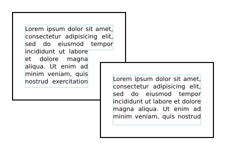
Horizontal text wrapping inside two overlapping rectangles using shape-subtract as well as shape-inside, shape-padding and shape-margin. The black rectangles show the content areas. The inner blue lines show the wrapping areas.
The shape-image-threshold defines the alpha channel threshold used to extract the shape using an image. A value of 0.5 means that the shape will enclose all the pixels that are more than 50% opaque.
For the purposes of SVG, this property applies to ‘text’ elements.
Except as noted, see the CSS Shapes Module Level 1 for the definition of 'shape-image-threshold'. [css-shapes-1]
The shape-margin property adds a margin to a shape referenced with shape-subtract. It defines a new shape where every point is the specified distance from the original shape. This property takes on positive values only.
Do nor re-specify shape-margin but reference CSS Shapes.
| Name: | shape-margin |
|---|---|
| Value: | <length-percentage> |
| Initial: | 0 |
| Applies to: | ‘text’ elements |
| Inherited: | no |
| Percentages: | N/A |
| Media: | visual |
| Computed value: | an absolute length |
| Animation type: | by computed value |
Except as noted, see the CSS Shapes Module Level 1 for the definition of See 'shape-margin'. [css-shapes-1]
The shape-padding property can be used to offset the inline flow content wrapping on the inside of elements. Offsets created by the ‘wrap-padding’ property are offset from the content area of the element. This property takes on positive values only.
An example of using shape-padding
.
<svg xmlns="http://www.w3.org/2000/svg"
     width="300" height="300" viewBox="0 0 300 300">

  <circle id="circle" cx="150" cy="150" r="125" fill="none" stroke="black"/>
  <text style="shape-inside: url(#circle);
	       shape-padding: 25px;
	       font: 18px DejaVu Sans;
	       text-align: justified;
	       line-height: 110%;">This is an
  example of wrapped text in SVG 2! There should
  be 25 pixel padding around the text. The text is
  justified on both sides. It looks good!</text>

</svg>

Horizontal text wrapping inside a circle with a shape-padding. The outer black circle shows the content area. The inner blue circle shows the wrapping area.
This image is a PNG. Figure out how to make a good SVG. Note: Chrome supports 'textLength' on 'tspan' but Firefox does not.
Except as noted, see the CSS Shapes Module Level 2 for the definition of 'shape-padding'.
Text layout begins by passing to a CSS-based text renderer the content of the ‘text’ element which includes text data along with styling information and a description of one or more shapes to be filled. The ‘text’ element is treated as a block element and its descendant ‘tspan’, ‘textPath’ and ‘a’ elements are treated as inline elements. The CSS renderer returns a set of typographic characters with their positions resulting from laying out the text as if the text were absolutely positioned.
A typographic character may contain more than one glyph. It is assumed here the relative positioning of the glyphs inside a typographic character is encapsulated by the typographic character and it is not user controllable.
Once a content area has been defined, the following algorithm is used to determine the typographic characters and their positions for a given ‘text’ element:
SVG allows the shape-inside property to reference more than one shape. Each shape should be filled in turn until there is no more text or no more shapes.
This means that text is laid out with the box width set to the inline-size value if writing-mode is horizontal-tb, or with the box height set to the inline-size value otherwise.
A number of CSS properties have no or limited effect on SVG text layout:
This ensures that the ‘text’ element is treated as if it were a block element.
This ensures that ‘


